Matlab Plot Function, Basic and Useful Tips
the flower of Matlab is drawing a graph.
I will share the codes I use often, so please freely scrape them and correct them.
1. Basic Code
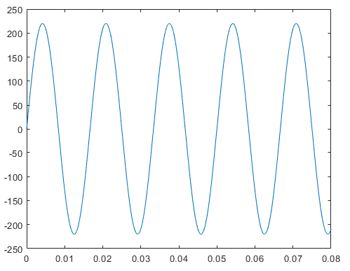
%% Setting
dt = 0.0001; % time step
t = 0:dt:0.08; % time
V = 220*sin(2*pi*60*t); % Data

%% Plot
plot(t,V)
I drew 220V, 60Hz voltages for explanation.
The dt in the second line is the time step of the graph, which is the interval between how often to dot the graph. It is comfortable to think of it as a concept like resolution. If the time step is too short, the simulation running time will be long. Otherwise, the long time step makes the graph is distorted, so be careful about the selection. Let's keep in mind that it's usually the main cause of "the graph comes out weird" proplem.
The t in the third row means to arrange from 0 seconds to 0.08 seconds at intervals of dt. Usually used as a value on the x-axis, which must be expressed in matrix (1 X n) for the x-axis value.
The V in the fourth row is the y-axis value, and must be the same size as the matrix in the x-axis value to avoid error.
The last line is a plot function that draws a graph, and you can put the x- and y-axis matrices in order.
2. Change Graph Color and Line Style
%% Color and Style of Graph
plot(t,V,':r')
I will continue to use the setting variables I used earlier to explain.
The above code means that V according to t is represented by a red dotted line. In other words, just refer to the table below and enter the required command, then the graph shape can be changed.
| Command | Line Shape |
| - | Solid Line |
| -- | Dashed Line |
| : | Dotted Line |
| -. | Alternate Long and Short Dash line |
| Command | Line Color |
| m | Magenta |
| c | Cyan |
| r | Red |
| g | Green |
| b | Blue |
| w | White |
| k | Black |
| y | Yellow |

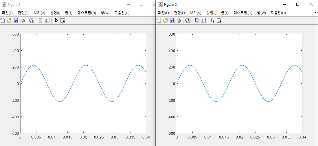
3. Change Display Range
%% Range Method 1
figure(1)
plot(t,V)
xlim([0 0.04])
ylim([-600 600])

%% Range Method 2
figure(2)
plot(t,V)
axis([0 0.04 -600 600])
There are many ways to change the range of graphs. Both methods were modified from 0 to 0.04 for the x-axis and -600 to 600 for the y-axis. The results are all the same.
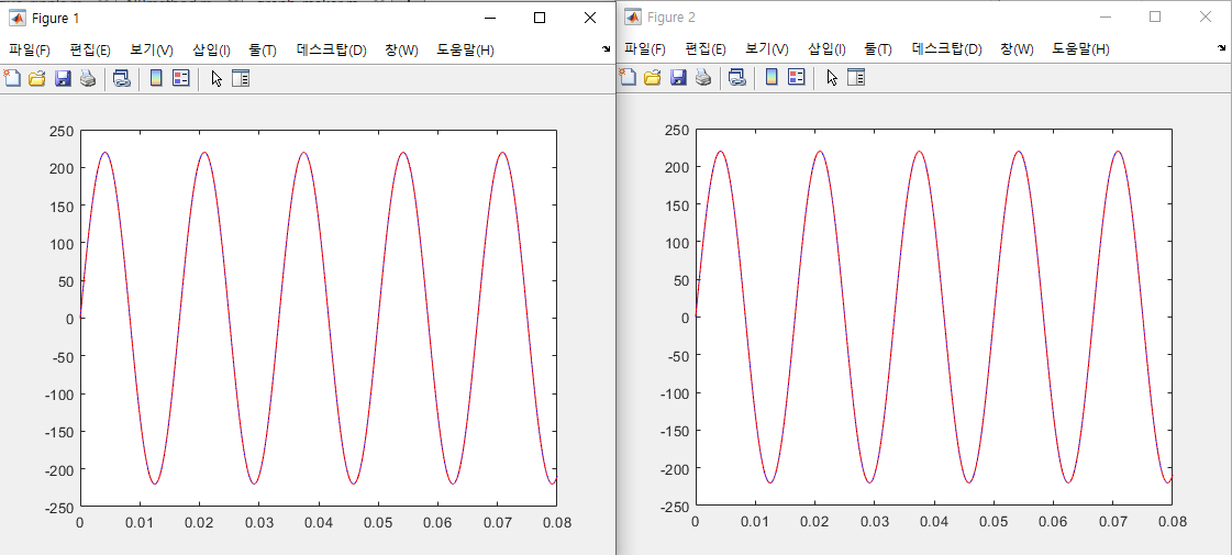
4. Overlapping Graphs
%% Setting
V1 = 220*sin(2*pi*60*t);
V2 = 220*cos(2*pi*60*t);

%% Overlapping Graphs Method 1
figure(1)
plot(t,V1,'r',t,V2,':b')

%% Overlapping Graphs Method 2
figure(2)
plot(t,V1,'r')
hold on
plot(t,V2,':b')
hold off
This is useful when you want to compare two or more data to one screen.
I usually use the above two methods.
The first method is simply to write down the x and y-axis vectors of the two graphs in one plot function.
The second method is to use the command 'hold on.' If you first draw a graph or float a figure window and enter the hold on command, the previous graph will not be reset. If you don't hold off, the graph will continue to overlap, so make sure to enter the hold off command at the end.
Both methods have pros and cons. If there are fewer graphs to overlap, the first method is simple, but as the number of graphs increases, the second method is more intuitive.
Note that the figure(1) or figure(2) command is a function that displays the graph window anew to match the parenthesis number.
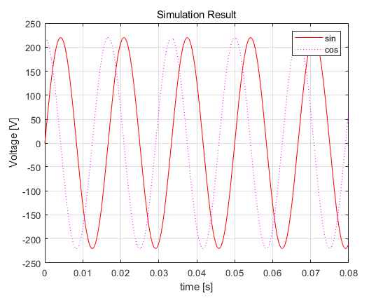
5. Decorating Graphs
%% Decorating Graphs
plot(t,V1,'-r',t,V2,':m') % two graphs
title('Simulation Result') % graph title
xlabel('time [s]') % x-axis title
ylabel('Voltage [V]') % y-axis title
legend('sin','cos') %legend
grid on % grid
I will explain using the preceding code.
Title means the name of the whole graph, xlabel draws the name of the x-axis, ylabel means the name of the y-axis, and grid on means the legend. If you don't want to, you may not mark it grid off.
'유용한 지식 > Matlab' 카테고리의 다른 글
| Get Matlab Excel Data | xlsread function (0) | 2020.09.24 |
|---|---|
| Using the Matlab 'for Statement' | Loop Statement (0) | 2020.09.24 |
| Using Matlab 'if Statement' | Assumption Statement (0) | 2020.09.24 |
| Matlab Graph Axis Tick | Plot Advanced Edit1 (0) | 2020.09.24 |
| Matlab subplot function (0) | 2020.09.24 |


댓글